Motivation Monday: Paris and its Neighborhoods

Take a look at this video made by Havas Worldwide working with Flying V to produce this animation of Parisian neighborhoods through typography.

I should note that I found this video not through their Vimeo account, Havas Worldwide, but through Hypebeast‘s article, Depicting Parisian Neighborhoods via Typography.

The level of thought and work put into this video is impressive and should motivate anyone. I really enjoyed the Champs Elysees part, which then transitions to the Eifel Tower. This movie uses two colors – black and white – and solely utilizes typographical animations to say so much more. If you know Paris and its districts, you’ll enjoy the video. Take a look and appreciate the work!

Web Design (Sundays): Navigation Part 1

Navigation Part I. It’s so important and should probably be one of – if not the – most important features in a website. Navigation has two parts: the front end and the intrinsic (or built-in) end.

The front end is what the consumers see. In other words, it’s what we see. We call up a site and we see the buttons/links/images that will lead us around the site.

A very quick and very brief look at the creation of website navigation.

A very quick and very brief look at the creation of website navigation.

The front end is what the consumers see. In other words, it’s what we see. We call up a site and we see the buttons/links/images that will lead us around the site.

I’m calling the back-end of website navigation intrinsic because it’s easiest to think of being built-in to the site. If the concept of the website doesn’t focus on ease of use for us, you can bet no one is hanging around long to figure out how to get around the site.

Navigation needs to be a focal point in a site from the get-go. When the developers are drawing up the site, the first step is to brainstorm what pages and content there will be. The next step is how it is all connected either by using charts, webs, maps – you name it. Then the front-end navigation needs to fulfill these back-end plans.

It’s a tall order certainly. But there are some basic things to think about if you’re creating a webpage or things to take in next time you’re web surfing. Continue reading

Motivation Monday: Do What You Love

Take it from one of the greatest inventors and business leaders of the modern-day technological industry: Steve Jobs. It’s as simple as this – to do great work, you must do what you love.

Poster I designed to embody Steve Jobs quote.

Poster I designed to embody Steve Jobs’ quote. The background is Chicago font, which was named after one of Jobs’ favorite cities.

My motivation for this Motivation Monday’s poster has come from Jobs and his appreciation of type. As I pointed out in my first post, Jobs spoke to Stanford’s graduating class of 2005. His appreciation of type and his pivotal role he played in pioneering the introduction of different typefaces on Macintosh computers in 1984 forever opened the gates for digital type. Continue reading

“Talking Shop” – An Interview with designer Holly Gibbs

I caught up with Holly Gibbs, a visual designer at Smart Media Creative. Her blog, The Cre8ive, and her personal website, Holly Marie Gibbs, showcase her work.

Gibbs’ background is in communication and began her design career through communication design. From there, she dabbled in web design and soon immersed herself in the industry. Today, she spends her work time – and her free time for that matter – designing. She tackles all kinds of design from branding to invitations. The field is an ever-changing learning experience, and it’s what she loves to do. A couple of her answers to my endless questions are below. Enjoy!

Q: What do you suggest for people tackling their own design or image? Do you have any helpful guidelines to share with those whose backgrounds are not in design?

Continue reading

Drew Banks Prezi on Typography

A neat presentation I ran across on Prezi is Drew BanksTypography presentation. It’s an excellent overview on what is typography.

There’s an explanation about type, its characteristics and the proper lingo when addressing the aspects that make up a font.

This is a great reference for guidance or clarification if you’re reading all about a font or dissecting a certain font for whatever reason. I think this presentation takes the language of typography and breaks it down into a “spark notes” version if you will.

Check it out!

How to update your website design in three simple steps

It’s difficult to put together a website that’s pleasing to the eye, simple to navigate and, well, gets the point across quickly. However, all websites should focus on doing so.

These are the three main ideas to think about when updating your website design below.

  1. Font choice
  2. LAYOUT
  3. Color selection

Font Choice

If you couldn’t already tell, I like fonts. As Ellen Lupton said, “Type is what language looks like.”

To update the page with fonts, choose up to three fonts. I wouldn’t suggest more than three. Even two fonts can create drastic effects on a page.

Here’s what to focus on: Use contrast – serif and sans serif fonts, explore various sizes and try different widths.
This can create a big difference in moments.

Continue reading

Resource Page

I wanted to introduce the “resource” page that’s a part of this blog. Here I will keep a collection of invaluable websites that help explain, showcase or highlight design or typography elements (or concepts or upcoming ideas, etc). If you have a suggestion for a site, leave a comment below!

Over: A Cool New App

While performing the usual font surf, I came across a page for Over, an app created by Aaron Marshall and Jeff Jackson at Potluck.

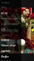
I bought Over HD ($1.99) which allows users to write text over their images and create designs in no time. It’s a neat app, and the steps below layout the easy process on creating your own photo with a great font.

Over Font Choice

CREATING A CUSTOM PHOTO

STEP 1 – Choose a photo from your Camera Roll or Take a Photo

STEP 2 – Tap to write your message or choose a font; there’s also an option to unlock many more fonts for $0.99. Of course I went for this. Doing so basically opened a long list of fonts you would find in a program like Microsoft Office and so forth.

Continue reading